
OVERVIEW
RAFO B is a fintech platform designed to help foreign workers manage and transfer money safely, clearly, and with lower fees.
For many users, this is a recurring and high-stakes action that directly supports their families. The product includes a mobile app for everyday financial actions and a website that introduces the product, explains how it works, and builds trust before download. I led the end-to-end product design across both platforms, focusing on clarity, accessibility, and confidence in a regulated financial environment.
What’s the core problem Rafo B is solving?
For many foreign workers, managing money is stressful. International transfers often involve high fees, unclear processes, and systems that are difficult to understand, especially for users who are not fluent in the local language or familiar with digital banking tools.
RESEARCH
Through conversations with stakeholders, product constraints, and user behavior analysis, several key insights emerged:
Users needed a simple, clear design language which is essential for users who are not familiar with complex financial systems.
Errors create stress and should be prevented whenever possible, not just handled after they occur.
Users need frequent confirmation and reassurance throughout financial actions

Goals and Design Strategy
The goal of RAFO B is to make sending money home feel predictable and trustworthy, even in a complex financial environment.
The product strategy focuses on reducing uncertainty at every step, allowing users to act with confidence
The People We Designed For
💛
Supporting their families from another country
💬
Less familiar with financial systems
🔁
Sending money regularly
⚡
Need simple and efficient tool to manage finances
We aimed to tackle a widespread issue with diverse manifestations: the desire for greater control and reduced isolation in financial management.
We kept hearing these sentences:
“I’m always afraid to press the wrong thing.”
“I feel like I'm throwing money away on remittance fees. It's hard-earned cash that should be going to my family.”
“If something goes wrong, it’s my family who feels it, not just me.”
“I need it to be simple. This isn’t something I want to experiment with.”
“I send money home every month. I don’t want to think too much, just do it and be sure it worked.”
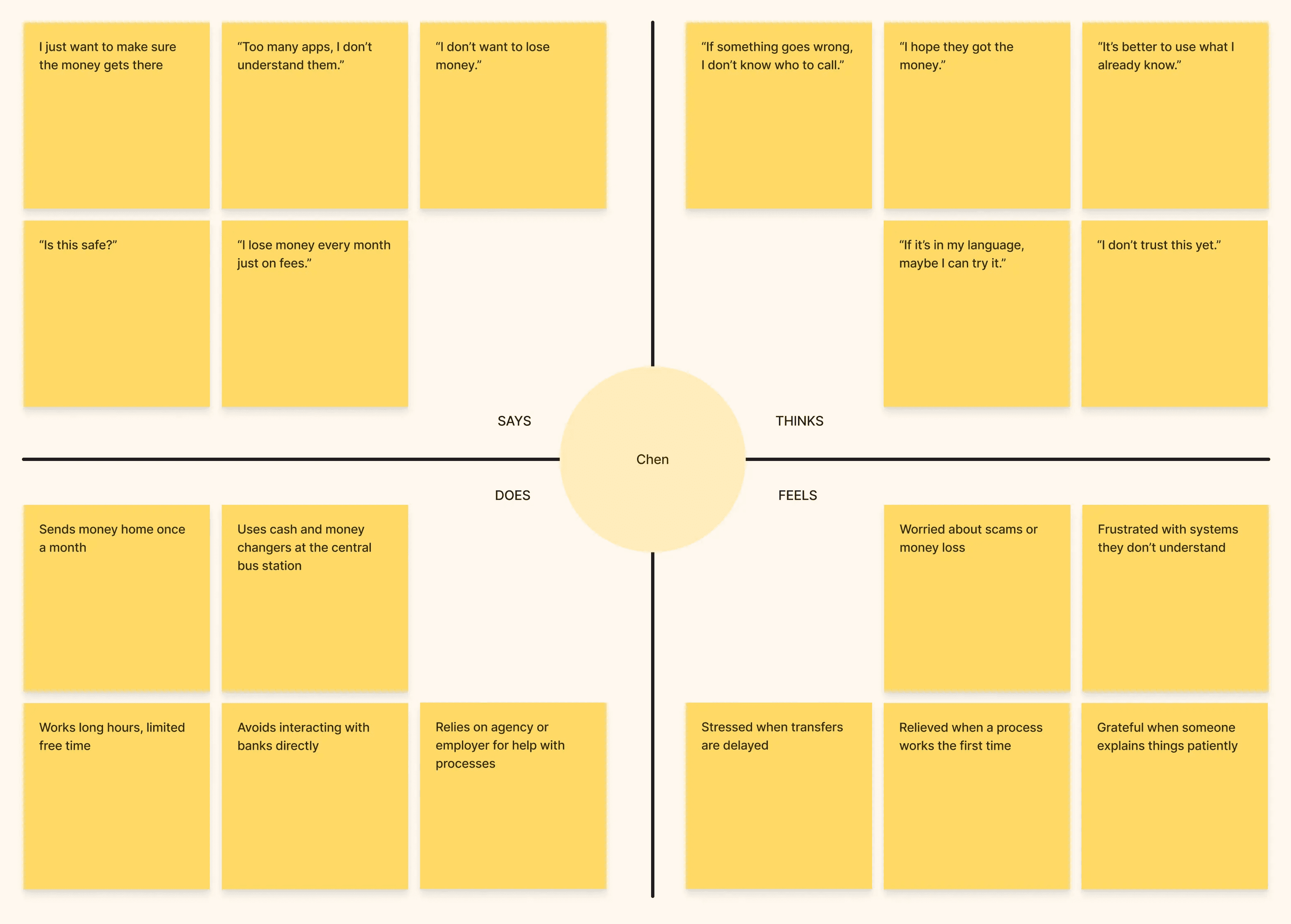
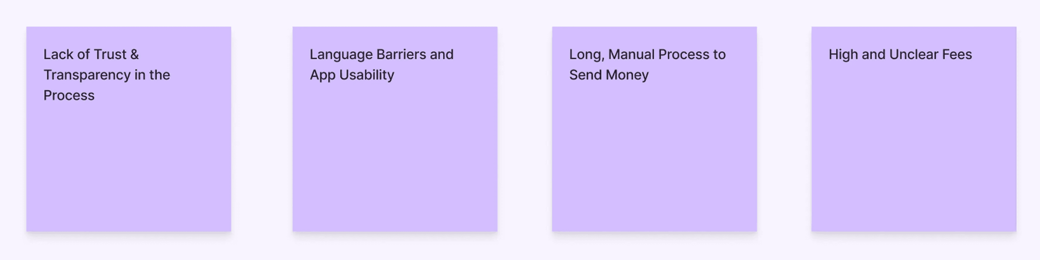
Pain Points
Measuring Success
To evaluate whether the product supports both user needs and business goals, we defined a set of key performance indicators. These metrics focus on trust, repeated usage, and the long-term sustainability of the product.

Understanding the Landscape
Before designing RAFO B, it was important to understand how similar financial products approach trust, clarity, and money transfers. The competitive analysis focused on identifying common patterns, gaps, and opportunities, rather than copying existing solutions.

Key Takeaways & Gaps:
The analysis showed that many competing products create unnecessary friction for users sending money abroad on a regular basis.
Common gaps included:
Long and complex flows that increase cognitive load
A strong reliance on financial knowledge and terminology
Oversimplified actions that hide important context
Limited consideration for users who send money internationally on a recurring basis
These gaps highlighted the need for a product designed specifically around frequent, high-stakes money transfers, with clarity and reassurance built into every step.
DESIGN
Before moving into visual design, I mapped out the problem space, user needs, and product priorities to align the experience around clarity and trust.
This early mapping helped define what truly mattered before translating decisions into UI.
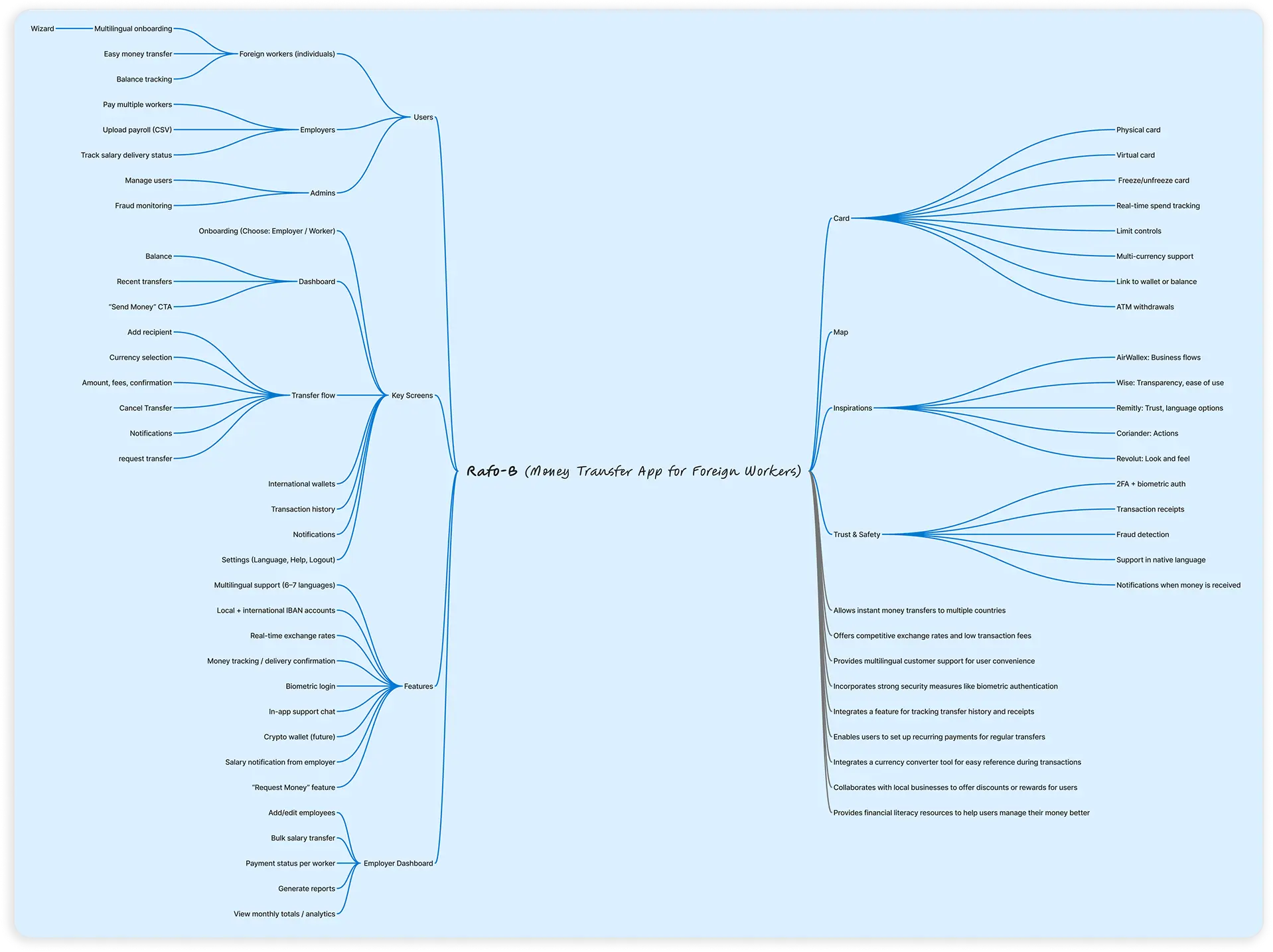
Designing the Core Transfer Experience
Sending money home is the core action of RAFO B.
The flow was designed to feel clear and predictable, reducing hesitation in a high-stakes financial action. Each step focuses on one decision at a time, minimizing cognitive load and reinforcing trust.

Home Screen
✅
Primary transfer CTA centered on scree
✅
Persistent send action in floating bar
✅
Balance prioritized at the top

Amount Screen
✅
Clear “You send” vs “Recipient gets”
✅
Transparent exchange rate
✅
One primary action

Currency Selection
✅
Searchable list to reduce scrolling
✅
Recently used currencies on top
✅
Flags for fast visual recognition
Structuring the Financial Foundation
Before users can send money, the product must establish legitimacy and trust.
The onboarding experience was designed to feel guided and reassuring, while meeting strict financial and regulatory requirements. Rather than overwhelming users with complexity, the process was structured into clear, focused steps.

Account Type
✅
Clear and simple choice
✅
Emotional context (family imagery)
✅
Focused primary action

Identity Verification
✅
Step-by-step guidance
✅
Visual progress indication
✅
Reduced anxiety during document upload

Progressive Trust & Security
✅
Clear time expectation
✅
Security framed as protection
✅
Visible home context behind modal
Designing for Repeated Use
RAFO B is not built for one-time transactions.
For many users, sending money home is not a one-time action, but a recurring financial responsibility.
The product was designed to support ongoing tracking, clarity of status, and fast access to familiar recipients.
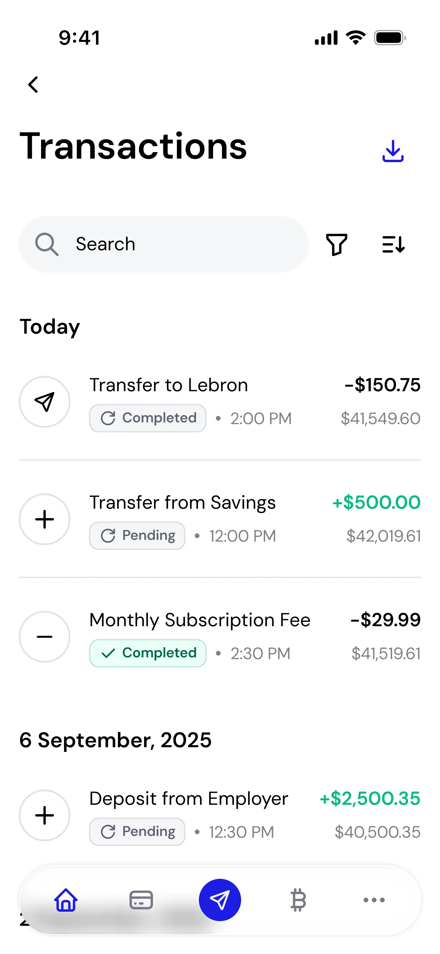

Transaction History
✅
Clear completed vs pending states
✅
Immediate visibility of amounts
✅
Date grouping for quick scanning
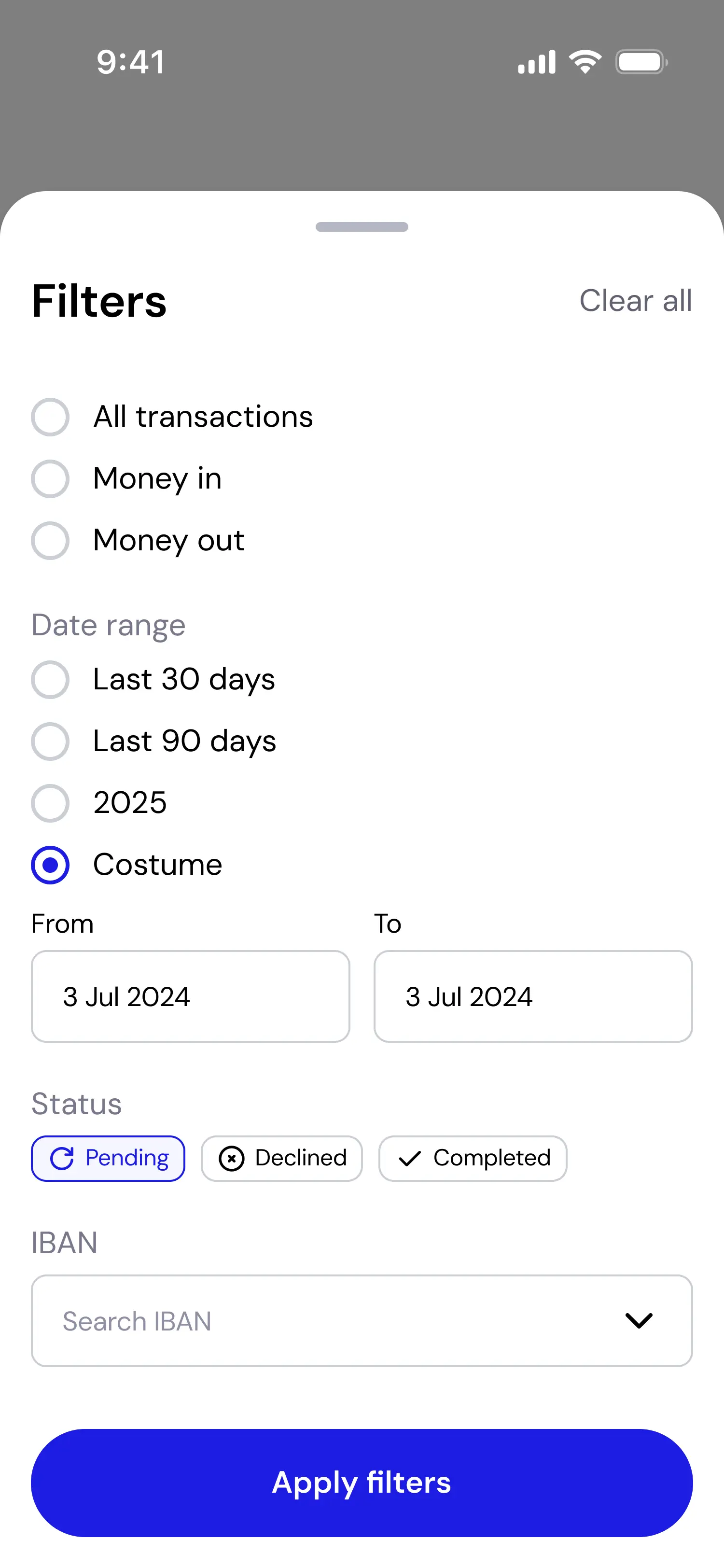
Transaction Filters
✅
Simple filtering logic
✅
Status-based segmentation
✅
Date range for financial control
Recipient Profile
✅
Quick repeat transfer access
✅
Behavioral insights per recipient
✅
Full relationship overview
Designing for Repeated Use
RAFO B is not built for one-time transactions.
For many users, sending money home is not a one-time action, but a recurring financial responsibility.
The product was designed to support ongoing tracking, clarity of status, and fast access to familiar recipients.

Crypto Dashboard
✅
Dark mode to signal context shift
✅
Real-time price visibility
✅
Higher data density

Wallet Selection
✅
Customizable asset visibility
✅
Reduced clutter through toggles
✅
Search-first interaction
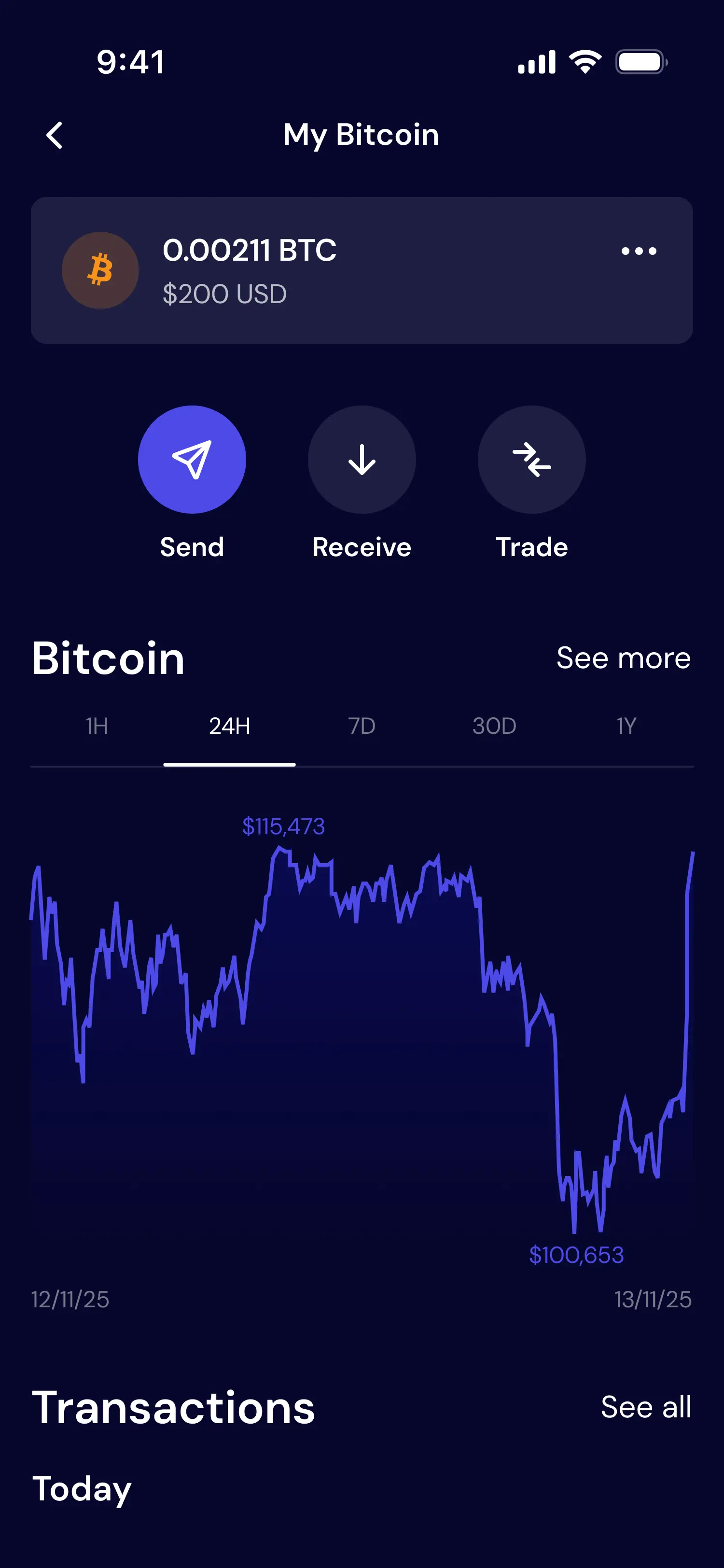
Asset Screen
✅
Clear volatility context (chart)
✅
Dedicated send / receive / trade actions
✅
Separation from core banking flows
EXTENDING TRUST BEYOND THE APP
Before users download the app, their first interaction with RAFO B happens on the website.
The website was designed to clearly communicate the product’s value, reduce uncertainty, and establish credibility.
Consistent visual language and messaging ensure a seamless transition from discovery to usage.

RESULTS & TAKEAWAYS
Designing a Scalable Financial System
RAFO B was built as a scalable financial ecosystem.
The design system ensures consistency across everyday banking actions and more complex features, while allowing contextual separation where risk perception changes.
Key principles that guided the product:
– Trust must be designed into every step
– Repeated actions demand simplicity
– Positive feedback reinforces user confidence
Thanks for scrolling!
Want to work together? - let's talk.
Next project